A Fresh Design for webtechie.be
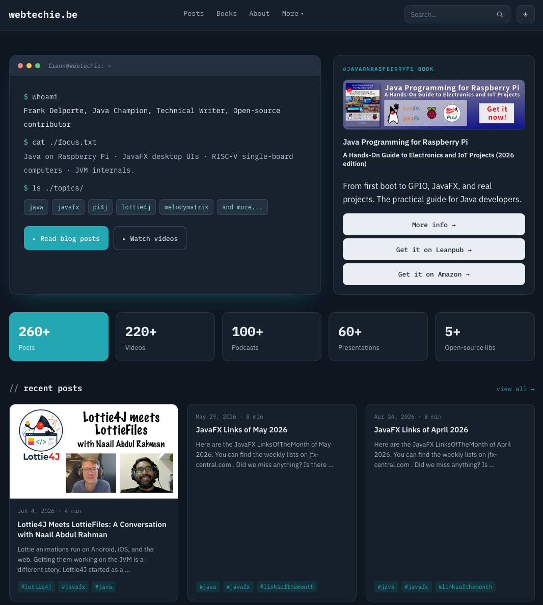
This website grew over many years into more than 260 posts, 220 videos, 100 podcasts, and 60 presentations. The old design buried most of that under a layout that no longer matched the way I write today. So I rebuilt it from the ground up, and the result puts the content first.
Visit webtechie.be , and you land on a cleaner home page that points you straight to the blog posts, podcasts, and my book. Those are things I spend most time on and deserve more attention. The new design also gives more space to the projects I work on, like Lottie4J, Pi4J, MelodyMatrix, and more. The old site had a lot of content but no clear way to find it. The new one makes it easier to discover what I have to share.
What changed
The redesign touches almost every part of the site. These are the changes you notice first.
- A new theme: The whole site moves to a terminal-inspired look that fits the topics I cover: Java, JavaFX, Raspberry Pi, and single-board computers.
- More focus on blog posts and podcasts : The home page and navigation push the long-form content forward.
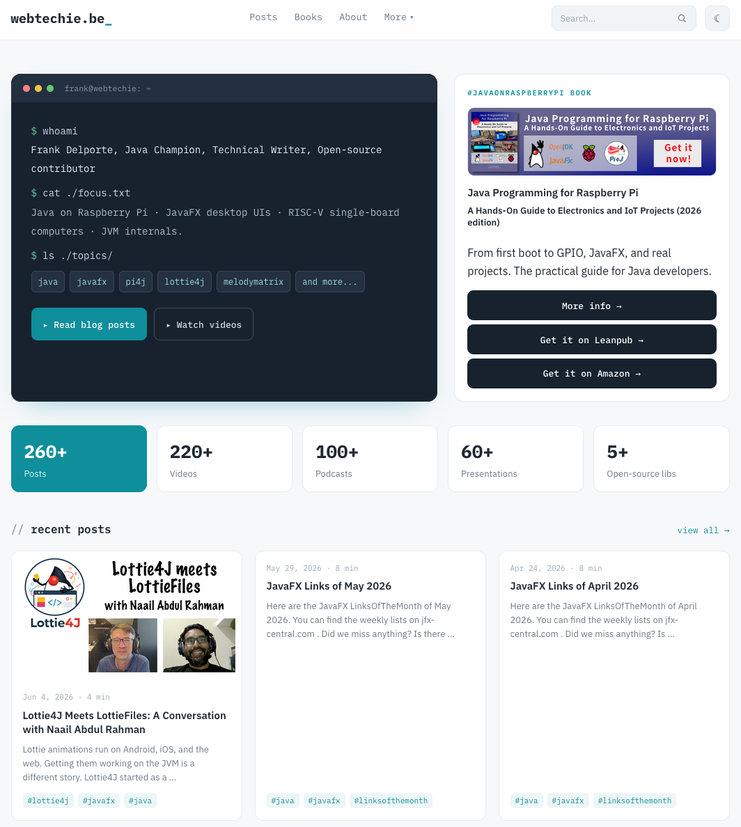
- A light and dark switch: You pick the mode you prefer.
- A search box: Find any post by keyword without scrolling through archive pages, using a redirect to DuckDuckGo’s search engine.
- A table of contents: Longer articles show a table of contents, so you jump straight to the section you need.
- Better use of tags : The tags got reviewed and have a short introduction.
- More RSS feeds: Each section and tag exposes its own feed, so you follow only the parts that interest you.
- Open source projects : Highlighted projects that I work on, like Lottie4J, Pi4J, MelodyMatrix, etc.
On top of these, the redesign carries dozens of smaller tweaks to typography, spacing, images, table layouts, and the metadata that drives social sharing.
How Claude Code helped
I built a large part of this redesign together with Claude Design and Code . It handled the repetitive Hugo template work, generated the new theme partials, and helped me track down the small details that make a site feel finished. One example: the social preview images now resolve correctly for every page, which used to break when I shared a link on LinkedIn.
Pairing with an AI assistant on this kind of project changes the pace. I describe what I want, Claude Code writes the template, and I review the result and adjust. The work that used to take an evening of fiddling now takes a focused hour.
Tell me what you think
The site keeps the same address and all the old links still work, so nothing you bookmarked should be broken. Take a look at the new webtechie.be , try the search box and the dark mode, and let me know what works for you and what does not. Your feedback helps me to further improve!